The Australian e-Health Research Centre (AEHRC), CSIRO's national digital health program and a joint venture with the Queensland Government, developed an Australian COVID-19 dashboard which was made available to state and federal health agencies.
The dashboard aggregated and analysed Australian and worldwide data to identify, analyse and forecast trends in the global outbreak, and to identify COVID-19 case hotspots.
It included visualisations, some of which were informed by statistical and epidemiological models developed in collaboration with CSIRO's Data61.
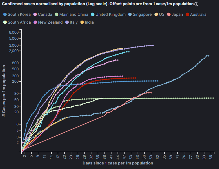
Line graph from the COVID-19 dashboard. Graph title: Confirmed cases normalised by population (log scale). Offset points are from 1 case/1m population. X axis: Days since 1 case per 1m population Y axis: # Cases per 1m population Legend:
The graph shows an initial steep upward trend with a flattening curve for the US, Italy, United Kingdom, Canada, New Zealand and Australia. South Korea and Mainland China show a steep upward trend then a flat line. South Africa and Singapore show a steep upward trend followed by a more gentle continued upward trend. India and Japan shows a continuing trend upwards along an approximate 45 degree trajectory. 